5 Ways Pantone Picks the Color of the Year
2014 Color of the Year: Radiant Orchid by @schulmanArt, Miriam Schulman
Ever wonder how Pantone picks the color of the year? Well they don't gaze into a crystal ball. This past weekend I had the chance to hear how Pantone arrived at Radiant Orchid for the 2014 Color of the Year.Guest Speaker at Surtex
Laurie Pressman, Vice President, Pantone Color Institute gave a talk at the Surtex Trend Theater (Surtex stands for surface/textiles). Mostly she talked about trends they are seeing for 2015/2016 but that deserves its own blog post. She also reviewed how Pantone chooses the color of the year and I found the process fascinating so I wanted to share that with you!| Radiant Orchid is the color of the azaleas in my backyard and my J Crew t shirt {see full art studio tour on Take A tour of my Art Studio!}
|
Color Trends in Fashion
The Runways are definitely a large contributing factor to choosing and predicting color trends... after all approximately 16% of designers included some form of radiant orchid in their color story. However, this is not the only source that Pantone considers.
 |
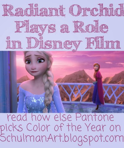
| Radiant Orchid was used in the backdrops and costumes in this popular Disney film, Frozen |
Color in Popular Films
Another contributing factor is pop culture. My kids are now "too old" for Disney- if you ever can be too old for Disney- so I hadn't seen Frozen. When Pressman flashed the movie still on her Power Point presentation it was glaringly obvious that radiant orchid played a dominant role in the backdrops, costumes and styling for this movie.
 |
|
James Turrell: Rendering for Aten Reign, 2013, Daylight and LED light, Site-specific installation, Solomon R. Guggenheim Museum, New York © James Turrell |
Color in Art Exhibitions
Art exhibitions definitely play a role in fashion trends... Anyone old enough to remember the Cleopatra craze in the seventies when the Kin Tut exhibition went on tour? Pantone took notice of the James Turrell 2013 light installation at the Guggenheim Museum in New York. The dominant color? Radiant orchid.
 |
Color Technology for Cars
Technology for creating colors for cars is also a good predictor of trends. The color purple started appearing not just on specialty cars like a Rolls Royce, but also on mainstream brands like this Mitsubishi hatchback.
Home Decor and Accents
Home decor and accessories are another barometer on trends. The color may appear in bathroom cabinets and other surface materials, purple paint ( my blog review on 11 Perfect Purple Paint Shades) or in an accessory, like pillows and purple art. My peacock art has been popular with collectors because of the purple shades. {see all my purple peacock art and accessories}
 |
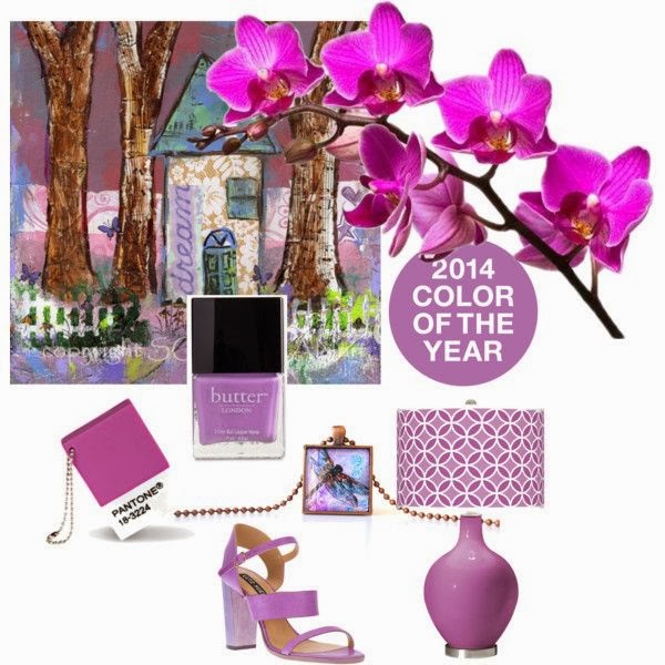
| Radiant Orchid seen on a plethora of products {more shopping details on Color Obsession: Radiant Orchid} |
Color of the Year is a Reflection rather than a prediction
Pressman pointed out that often the color of the year will appear in a previous year and then it gains momentum with consumers. We have been seeing purple as a trend in recent years taking many forms. Pantone's report is more of a reflection of trends already happening in the marketplace rather than a prediction.
| Lots of etsy finds in Radiant Orchid! |
