A tour of my Watercolor Palette


Today I thought I'd share some of my secrets of watercolor painting and give you a tour of my watercolor palette. I use a John Pike plastic palette that I bought 20 years ago and I am still using the same one with many of the same colors placed in the original arrangement. I have my warm earth tones on the left my reds and pinks across the tops and my cool colors to the right. The palette has a lid which is great because I can reuse my colors after they dry by spritzing them with an atomizer.
 |
In addition, to this palette I also have a pill holder which I keep some extra colors that I am not ready to commit to the permanent collection.
 |
Some colors are interchangeable
You may wonder why I have multiple shades listed in a single well. Usually they are interchangeable colors that have similar color temperatures, opacity and staining powers. Moreover, sometimes different brands have very different shades for the same color name.
 |
All about Yellow
For example, the raw umber from Holbein/ Daniel Smith/Winsor Newton are so different that it is worth it to me using them all. Especially when creating portrait work. That is also why I need both cad.yellow and lemon yellow. When creating landscapes or floral paintings, these pigments are interchangeable but I only use cad. yellow in flesh tones and lemon yellow for making blond hair.
 |
Orange you glad I told you?
The "orange" corner has a mixture and hodgepodge of colors. Anything from Daniel Smith's burnt orange, to cadmium orange. I don't use orange a lot but sometimes it punches up a watercolor painting or can act as a warm yellow. While writing this I realize that a lot of my paintings have orange but this is usually cadmium red that is an orangey red that reads as an orange when placed next to blue. So let's just say I don't use orange from a tube that often. The other color I use a lot is burnt sienna. This color also looks like orange. I use it alone, in flesh tones and mixed with other colors. Mixed with cobalt blue burnt sienna turns a lovely transparent gray. Mixed with phtalo green it becomes a warm dark forest green.
 |
| Peonies- watercolor by Miriam Schulman, in a private collection, Prints available on etsy ©SchulmanArt |
Red Hot
Now for a tour of the reds. There are two reds: cadmium red and winsor red. Did I not put winsor red on my palette? Well I do use it in mixtures to make "blacks" Cad. red is a fire engine red whereas winsor red is a cool ruby red. Next comes the pinks. I always used permanent rose but I am being told it is a fugitive color which means that it will fade over time so I am trying to transition to opera rose. Sometime I will squeeze rose madder into that well. The opera rose I got for free from one of my watercolor supply stores. Scarlett Lake is a beautiful strong pink. It stains easily, it's transparent and I love it for creating flesh tones in light skinned caucasians. I was introduced to this color by Ton Hill in his watercolor book and has become a favorite ever since. Sometimes the well shares space with Winsor red. They are very similar.
The next well contains my transparent warm reds. you don't need to own all the colors that I mention in this well. They are for the most part interchangeable and I am trying to use up some of the colors I bought over the years. My favorite is probably Brown Madder which I had learned after reading an article about Peter Stimling, another watercolor portrait artist. This is great in flesh tones, but if you are painting bricks, you may want to use Carmine and if you want a blood red then nothing but Alizarin Crimson will do.
Living next to that well is Indian red, a color I am beginning to fall out of love with. It is very opaque and you can get very similar affects by mixing cadmium red with cobalt blue. However, it is convenient and I probably reach for it when painting bricks or mixing.
It isn't easy being green
 |
| watercolor by my teacher/mentor Mel Stabin |
Greens are probably the trickiest colors to use for my watercolor students. I have my favorites and standbys. Pthalo green mixed with quinacridone gold gives you olive. I do have olive green, but really it is a convenience mixture good for covering large areas when I want to paint fast. I used to use sap green but can't stand it any longer. I don't like my students using it either. Sap green looks like the green oval in a children's watercolor set and there is no faster way to make your painting look amateurish than using sap green the wrong way. That said, I know that Mel Stabin uses sap green magnificently.
Not quite green and not quite blue is my latest favorite color, Cobalt turquoise.This pigment has wonderful granulating affects and has a soothing quality. Turquoise is a hot color in decorating trends as well, and paintings with it look great in modern decors. Next, I have Viridian Green which I don't use often, but I probably should. The shade is feminine and not quite as harsh as Pthalo green, yet it is strong. I can use it on its own or softened with burnt sienna.
Blue Mondays
All of my blues I love equally like children, but sometimes I forget how great Thalo blue can be and I doubt I have ever finished a watercolor painting without reaching for Cerulean or cobalt blue.
Download your free watercolor supply list!
I've curated a list of the ultimate watercolor supplies that I use every day to get fabulous results.
You can download this list for free to get started!

About the Artist (Miriam Schulman)
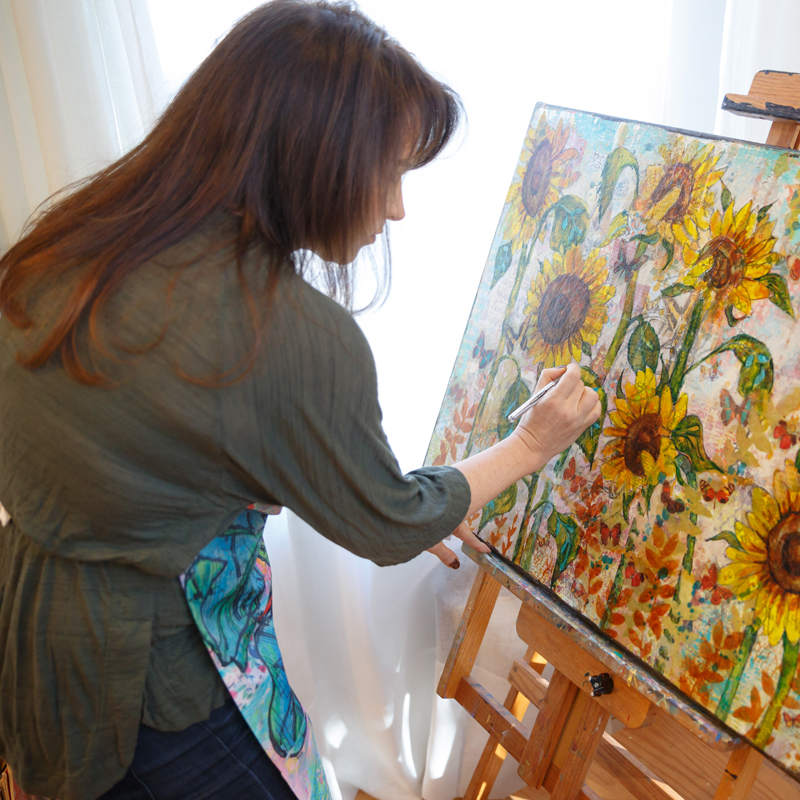 |
| Miriam Schulman, founder of the Inspiration Place |
Come see what kind of art I create at www.SchulmanArt.com or join the fun at TheInspirationPlace.net