Are you making these 3 mistakes with your watercolor paintings?


A common frustration I hear beginning watercolor students is confusion over the wide variety of pigments and paints.
In my online watercolor course on painting the figure, I got this question from one of my students:
QUESTION: I have read a suggestion of picking one red, one blue and one yellow for a painting and for harmony, mixing all the colors from those three primaries. However, I notice you use more than one of each. Is this the option of the artist...to either bend the rules or not have any rules at all? How many colors do you typically use in a painting? Also, how do you determine when to use the Cad Red, the Rose and the Scarlet Lake?
First of all, that is not a rule that really applies well to watercolor painting. Although you can create a successful painting using a single triad ( one red, blue, and yellow) you might struggle to create realistic looking flesh tones that evoke light and shade. I typically use around 8 colors when painting the figure and I do follow a set of rules which I teach in my classes.
Stick to one or two experts...ignore the rest (tweet this)
Here's the funny thing about rules and experts. If you listen to too many different experts, whether the subject is painting, love or marketing you will get confused and overwhelmed. Find one or two trusted mentors and stick with their advice and ignore the rest.
Guilty or innocent?
Here are the most common misconceptions about painting with red paint, are you guilty or
innocent?
1. Are you using only one shade of red?
2. Are you using an opaque red to glaze?
3. Do you understand the difference between warm and cool reds?

|
Yasgur's Barn, watercolor by Miriam Schulman has a warm tone- how odd would it be to have a pinkish barn? Might be okay, if that were your intention. |
Warm versus Cool Reds
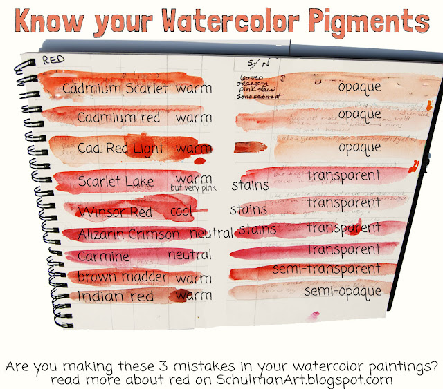
Oh my gosh, yes there is a difference. I put together a chart to help you "see" or reference the difference but the simplest explanation is that a warm red tends more towards orange since it has yellow undertones while a cool red will tend more towards pink as it has blue undertones.
This matters when you are mixing colors so you don't end up with mud and this can also be helpful when depicting red objects in light and shadow. You may want to use a warm red in the sunlight and a cooler red in the shade.
|
Pretty Peonies by Miriam Schulman. No two ways about it. If you want to paint pink flowers you better get a tube of rose. |
You need "rose" for pink
Not shown in the chart are all the pigments that are "rose." Rose is truly a pink paint and very useful to watercolorists since you can't add white to mix pink. Therefore, you need to rely on pink paint to do that job. So if nothing else, you will need at least two shades of red if you plan on including red and pink in the same watercolor- and this would be critical for portrait and realistic figure paintings.
 |
|
I Hear a Symphony, watercolor by Miriam Schulman Don't even think about painting portraits without understanding which reds are transparent and therefore appropriate for glazing and which ones will make a muddy mess. |
Opaque versus transparent
Although watercolor is mostly considered a transparent medium, as compared to acrylics or oil paints, you will find that there are some pigments that are more transparent than others. This is very important if you choose to apply a transparent glaze to tone a color. For example, let's say that you are painting a woman's face and you want to put a "blush" on her cheeks. You would need a transparent glaze or red in order for her not to look like a cosmetics clerk from a department store.
If you have any other question, please leave them in the comments below. I will answer them here or in a future blog post.
Other stories you might like
Download your FREE ultimate watercolor supply list to get the exact list of paints, brushes and paper I use everyday to create my watercolors!
Want to go deeper and learn all my watercolor Secrets?
Check out my online class, Watercolor Secrets!
Which of these watercolor crimes were you guilty of?
About the Artist (Miriam Schulman)
 |
| Miriam Schulman, founder of the Inspiration Place |
Come see what kind of art I create at www.SchulmanArt.com or join the fun at TheInspirationPlace.net

