Metamorphosis in Art
Art whether it is traditional painting or a modern mixed media piece is often created in multiple stages and layers. Earlier layers may be beautiful but often the under painting gets covered up with subsequent layers. Just as in life, you can not be too in love with your younger earlier versions of yourself or you can't move on and change. Although I loved the first stages of these artworks, I knew the art had to evolve and grow so I gave myself permission to allow change.
If you become too attached to the first stage, you can't move on. Babies are cute too, but they can't stay babies forever... you have to allow them to grow and change. Then they may also be beautiful teenagersm but then again they need to change and add layers in their lives and move on. As we age we must embrace changes and our ideals of our beauty change with it. Wrinkles and freckles are beautiful as they show experience and the passage of time.
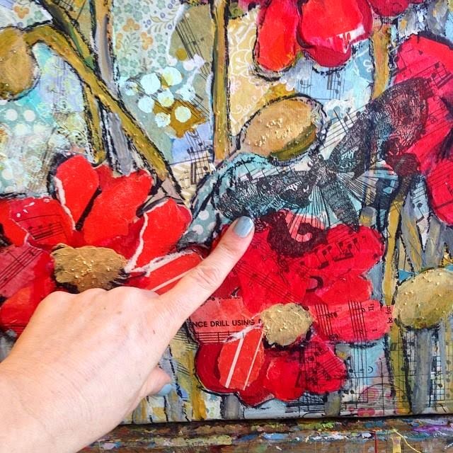
With these two artworks, I took two paintings which I really liked and thought they were beautiful but decided they had become stymied in an adolescent phase and not allowed to fully mature. By adding layers of detail, I added meaning and beauty to each artwork.
I asked my facebook and instagram followers, "What color should I paint this butterfly?"
The most popular choice was yellow which led the way with 30% of the comments. Shades of blue ranging from aqua, teal and turquoise was the second choice garnering 20% of the comments and shades of purple including violet, lavender and fuchsia into the purple category had one less vote than blue. Orange or white were the choice for many getting 10% each and two people told me not to paint it at all and leave it the way it is! Several people asked for multicolored butterflies or even green.
I'll tell you a secret-- for the butterfly in question I had absolutely no intention of going by a popular vote. In fact, I had already begun painting it orange as the comments poured in. However, I was intrigued by many of the suggestions so I painted a few butterflies in the other colors and held them up to the canvas to see what affect they had. I ended up using a blue-violet shaded butterfly in other areas of the canvas. And then blue became an accent color around the sides of the piece. I felt this added a tribute to the art that was once so dominated by the cobalt blue shade.
Sometimes art is about letting go too
If you become too attached to the first stage, you can't move on. Babies are cute too, but they can't stay babies forever... you have to allow them to grow and change. Then they may also be beautiful teenagersm but then again they need to change and add layers in their lives and move on. As we age we must embrace changes and our ideals of our beauty change with it. Wrinkles and freckles are beautiful as they show experience and the passage of time.
Art must grow and evolve
With these two artworks, I took two paintings which I really liked and thought they were beautiful but decided they had become stymied in an adolescent phase and not allowed to fully mature. By adding layers of detail, I added meaning and beauty to each artwork.
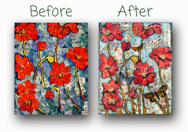 |
| Which do you like better? The art before or after? The "before" art can no longer be collected as an original artwork, but prints are available of this art on imagekind. The art on the left is called Poppy Hoppy The art on the right feels like a completely different artwork, so deserved it's own name, just like we don't call butterflies "caterpillars". The art on the right is Butterfly Brahms. 16x20" original mixed media collage art |
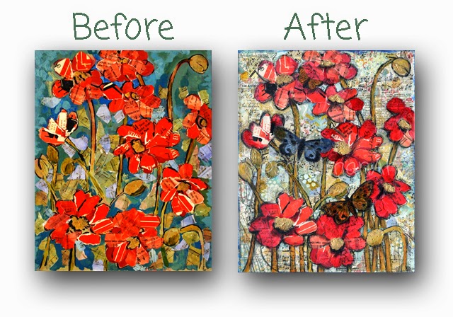 |
| How about this one? Do you like the art better before or after? The art before is called Poppy Don't Preach and you can collect it as a fine art print in your choice of size and finish from imagekind The art on the right is renamed Beethoven Butterflies and you can collect the original 16x20" canvas from my etsy shop. |
 |
| Want to save on this art right now? let me email you the latest coupon |
 |
|
I asked my facebook and instagram followers "What color should I paint this butterfly?" |
What color should I paint this butterfly?
I asked my facebook and instagram followers, "What color should I paint this butterfly?"
 |
|
Beethoven Butterflies, If you want to own this art you can collect the original mixed media art on canvas or a fine art print in your choice of size and finishes. |
What my social media followers picked
The most popular choice was yellow which led the way with 30% of the comments. Shades of blue ranging from aqua, teal and turquoise was the second choice garnering 20% of the comments and shades of purple including violet, lavender and fuchsia into the purple category had one less vote than blue. Orange or white were the choice for many getting 10% each and two people told me not to paint it at all and leave it the way it is! Several people asked for multicolored butterflies or even green.
What I did
I'll tell you a secret-- for the butterfly in question I had absolutely no intention of going by a popular vote. In fact, I had already begun painting it orange as the comments poured in. However, I was intrigued by many of the suggestions so I painted a few butterflies in the other colors and held them up to the canvas to see what affect they had. I ended up using a blue-violet shaded butterfly in other areas of the canvas. And then blue became an accent color around the sides of the piece. I felt this added a tribute to the art that was once so dominated by the cobalt blue shade.
 |
| Butterfly Brahms, Collect this or any red poppy art from my etsy shop.If you love butterflies, then explore all my butterfly art . |