Edited by SchulmanArt with research by Lizzie Turovsky
Are you looking for paint colors for living room or family room? Brown paint can be a wonderful counterpoint for art and provides contrast and harmony. Discover what interior designers have to say about using brown paint colors in your home decor.
Seeking the perfect brown for my family room
So this summer I am purging my house and taking care of some long neglected problems ( you may like Hoarding vs Harmony) One project that has taken priority is painting my den and replacing our box tv with a flat screen. (yes, it is my only tv. No, I am not embarrassed...but my kids are...) Since the tv room is the center of the house, I wanted to make sure that it was a space pleasing to me, my guests and my family. The adjacent powder room is getting a glamorous makeover too. In the meanwhile, I am in search of the perfect brown color.
 |
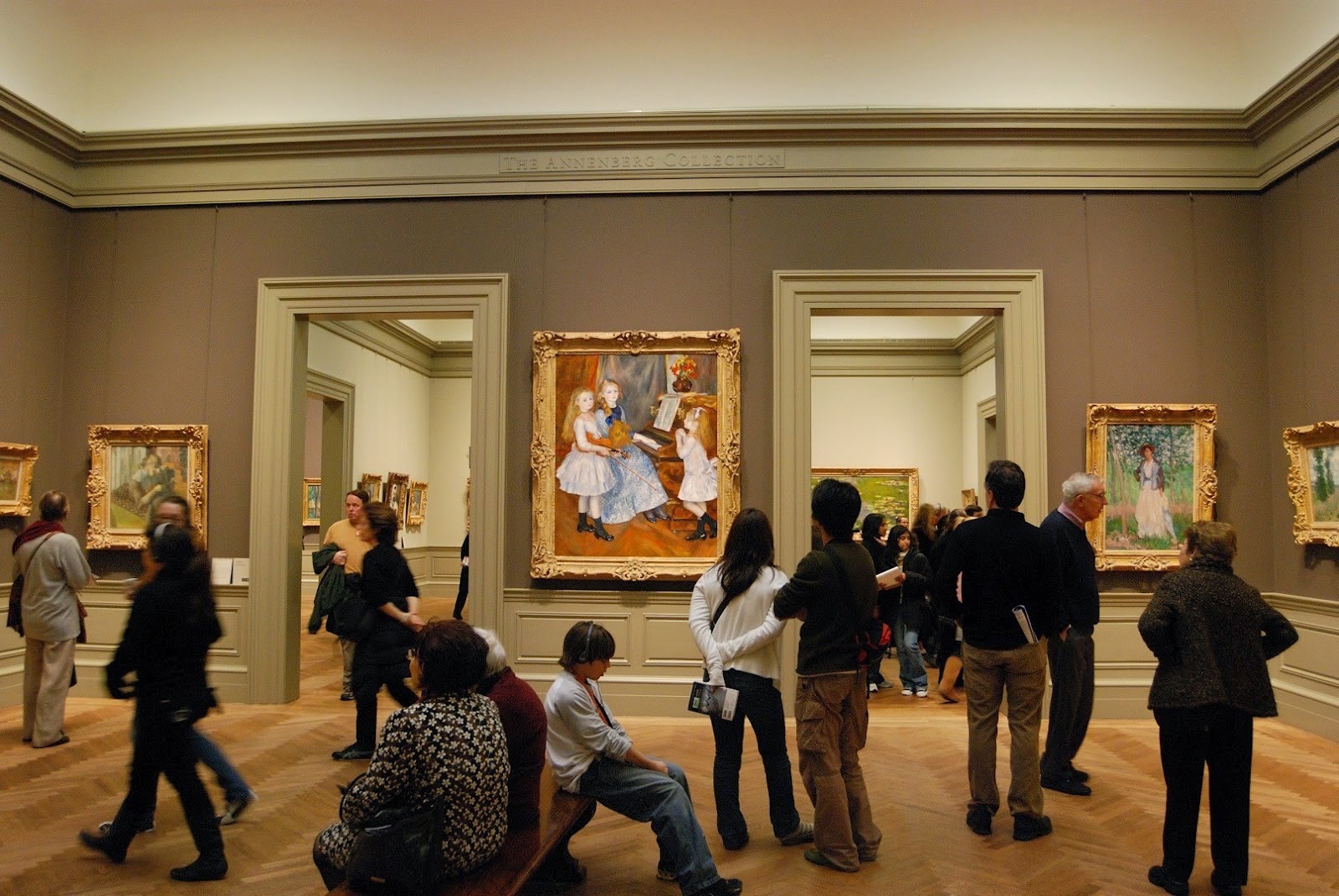
| Metropolitan Museum of Art |
Why dark brown
Whenever I go to museums, the art looks fantastic on the dark brown walls so I really want to showcase my art on the dark walls as well as create a masculine space. Warm versus cool
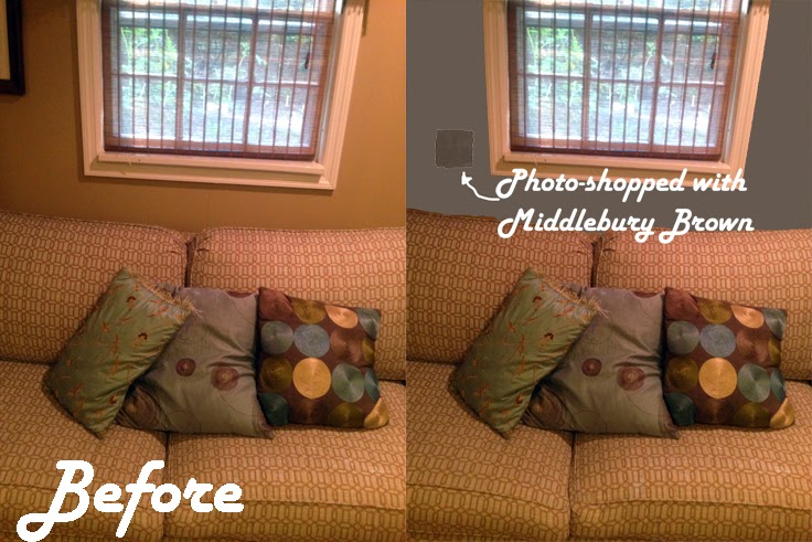
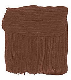
When looking at browns the main thing you will notice that some are very warm with red undertones and others are more "cool" and gray. Since I like to decorate with a lot of turquoise, I was in search of a cool brown that was dark without a purple cast and would show off the white trim, my artwork and the tv built-in. I am considering Middlebury Brown as the front runner. What do you think of this color for my den?
 |
| What's interesting is that the paint sample looks brown, but when I photo-shopped in the color it looked like a dark blue-gray. |
What the Experts Say:
"I feel about brown the way Holly Golightly felt about Tiffany's — nothing bad can happen to me in a brown room. I like the color as close to Coca-Cola as possible, not too umber and not too black. Mix it with McCloskey's glazing compound, which gives it a depth and resonance you're not going to get with gloss paint. I used it in my bedroom and it feels very tranquil. I go into that room and instantly fall asleep." -Eric Cohler
 |
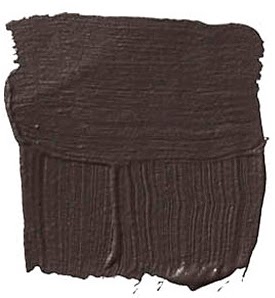
BENJAMIN MOORE CHOCOLATE TRUFFLE 2096-20: "Brown can look very traditional or very modern. Remember the 1960s? That was brown and gold and orange, which I would not do. Too period. I like it with lots of white — and pink or lavender or apple green. I just used it in a powder room with a white plaster mirror and peony-pink accents. The whole thing looked like a strawberry-cream chocolate bonbon. Very yummy." -Stephen Shubel |
 |
BENJAMIN MOORE APPALACHIAN BROWN 2115-10: "Brown is the new neutral. It's more courageous than taupe. I like my browns the way I like my chocolates — dark and rich. I'd use it in a bedroom, a library, a TV room and add magenta, turquoise, purple, or emerald green. People are generally afraid of dark colors but this is a classic, right up there with navy blue or burgundy." -Larry Laslo |
|
 |
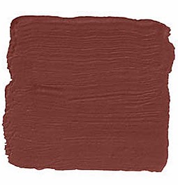
FARROW BALL ETRUSCAN RED 56: "This reminds me of those wonderful neoclassical rooms by Karl Friedrich Schinkel in Berlin, or Robert Adam in England. It has an excitement that straight brown doesn't have because of that hint of red, and I love red. I would glaze it for extra depth and do the woodwork in faux-stone. Bring in a little gold, a deep green. Modern furniture on bare wood floors with a Greek vase in the middle." -David Easton |
|
 |
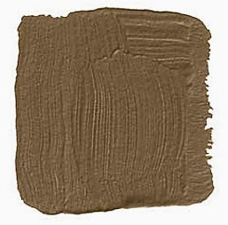
PRATT LAMBERT AUTUMN DUSK 12-19: "I have this in my bedroom and I absolutely love it. It's a tea-leaf, caramely brown with a hint of green in it, which gives it more life than the typical brown. It doesn't die at night. Very earthy, yet sophisticated at the same time. It brings out other colors. Try it with mustard, lavender, cerulean blue. Or cinnabar red, blush pink, black, bone." -David McCauley |
|
 |
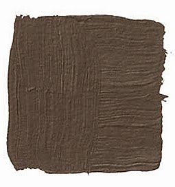
BENJAMIN MOORE MIDDLEBURY BROWN HC-68: "Our first apartment was under 600 square feet, and I painted it this dark gray-brown. My husband and I have a lot of stuff, and something about the dark walls made everything look orderly, even if it wasn't. Furniture and fabrics and artwork suddenly stood out. All the moldings were painted white, and that contrast really crisped it up." -Alexa Hampton |
|
 |
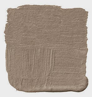
FARROW BALL LONDON STONE 6: "This is a warm, taupey brown. Not too dark and not too light. It's the color of raw unbleached Irish linen, of sand and shadow, of French limestone. Actually, it's like a Swedish brown, if there were such a thing. It has that beautifully grayed tone. I'd bring in a grayed blue as an accent." -Kerry Joyce |
|
 |
RALPH LAUREN PAINT GALVANIZED UL12: "Brown is a masculine color that looks great with feminine colors like pink and coral and robin's egg blue. It's one of nature's neutrals, which is why it works with just about anything. This is the color of the peat moss that covered the flowerbeds back home. It has some red in it, which makes it warm. In a high-gloss finish, the walls are there but it looks as if you could almost go through them, like dark water." -Todd Klein |
|
Other articles with interior paint ideas for your living room, bedroom and more:

Do you love art and decorating?
