What's new with Color Trends (2016)
 |
It should come as no surprise to you that I absolutely love studying color trends. There are whole industries devoted to studying color trends because it helps retailers and manufacturers choose colors for their product lines that will most likely be successful for consumers. |
Instead of gazing into a crystal ball and simply trying to predict what will be popular, these industry experts study what is already happening in the world and the market place. They study the colors in popular movies, museum exhibitions and fashions. Often, it is a cultural mood that will lend people to be drawn more to specific colors.

 |
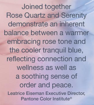
| For 2016, the experts at the Pantone Color Institute have actually chosen two colors, rose quartz and serenity. Their explanation that the trend is a blend of these colors and consumers are drawn to them because they create balance and clam which we are increasing seeking in our overly stimulating chaotic world. |
Fun quick video on how the new colors make us feel
How colors influence art
None of us can avoid being influenced by our environment and I find these colors creeping their way into my artwork even before the announcements are made. At the end of 2015, I found myself creating a whole "word ornament" collection around these two colors. And these colors have crept into my new musical art collection as well.
 |
Here, I have shown one of my latest painting, Monarch Maestro, against a backdrop of a serenity blue wall. In this room, you will also find pink accents that add brightness. The result is a room that soothes the soul like the string melodies of violin. |
 |
| If you look carefully at this violin art, you will notice the soothing shades of rose and blue blending harmoniously. These colors keep the exuberant patterns of the mixed media art from overwhelming it. Color trends from prior years also linger, like the brown from 2015, and the radiant orchid of 2014. (you can read about those color trends in my blog posts: What's new with color trends and 5 Ways Pantone Picks the Color of the Year) |
 |
| In this saxophone painting, I resisted the urge to add too much pink so the effect is calming but not overly feminine. This art would also look great against a blue wall, but art is always a quick cheat to add color to your room even if you keep the walls neutral. |
Look for more pink and blue
Other blog posts you might like
In Case We Haven't Met Yet...
 Hello! I'm Miriam Schulman and I create mixed media art to tell stories. I also teach other people how to craft their stories with art. I give them the techniques they need to get the results they desire which brings more joy to their lives.
My art has been published by Somerset Studio, Art of Man and the New York Times among others and collected by an international audience. When I'm not working on art in my studio, you'll find me in a museum spending time with friends or family. Explore my art at SchulmanArt.com or join the fun at TheInspirationPlace.net